Pure Sport Images: The Art of Color in Melbourne Sports
Melbourne sport has a specific kind of light. It can be steel-bright on a winter afternoon, then soften into something almost cinematic by late afternoon at the MCG. The city also moves fast. Trams and traffic change your timing, crowds surge and thin, and play never pauses for a photographer to get comfortable.
That is why I care about color so much. Not just the “pretty” side of it, but the practical, on-the-ground kind of color that tells the story of the game accurately. When people look back on a match, they remember the pressure, the momentum, the shape of the moment. Color helps lock those memories in place.
At Pure Sport Images, Melbourne sports photography is not only about catching action. It’s about making the scene feel true, even when the conditions are anything but.
Why color is the real challenge in sports
Most sports photographers start by chasing sharpness and timing. Those are essential. But color is where the work becomes harder, because color is rarely consistent across an entire day.
In Melbourne, you can step from outdoor daylight to indoor stadium lighting, then back again for a night game. Each environment behaves differently:
- daylight shifts with cloud cover and the sun’s angle
- stadium lights vary in temperature and intensity
- screens and LED signage can cast mixed colors on uniforms and skin
- camera sensors react differently depending on whether you use auto white balance or lock it
When your color is off by even a little, the audience notices in ways you might not expect. Skin looks too orange, greens turn sickly, or whites stop reading as white and start looking grey. That can make an otherwise perfect frame feel “off” when it’s viewed at scale, especially in team galleries where thousands of images are judged quickly.
I’ve seen it happen in post processing late at night. You deliver a set that looks fine on a laptop, then clients open it on a calibrated monitor in their office, or share it on social media, and suddenly everyone is asking why a player’s kit looks warmer or cooler than usual. Color problems are rarely dramatic in raw files, but they become obvious when viewed consistently.
So the goal is not to make everything look like a magazine shoot. The goal is to make the color behave like the memory of that venue, that match, that moment.
Melbourne light: the city’s gift and headache
A lot of photographers talk about “golden hour” as if every sport lands neatly inside it. Melbourne does not cooperate.
On a Sunday, I might be shooting track work at training grounds in strong sun, then drive across town for an evening AFL practice, then end up at a junior match under lights that have a different character again. If you’ve ever tried to keep a consistent look across those stops, you know the problem: color shifts even when nothing “feels” like it changed.
One practical example I run into often is green turf. Depending on venue and lighting, turf can land anywhere from deep emerald to almost lime. Some stadiums also reflect light differently, so turf can look greener when the camera faces one direction and flatter when it faces another.
That matters because the human brain reads turf color as environmental truth. If the greens look too bright, the whole image starts to look artificial. If greens are too muted, the match loses energy.
Color management is not a single setting. It’s a series of decisions that reflect real-world conditions.
The camera settings I trust when action won’t stop
Sports photography Melbourne work often comes down to speed, and speed demands choices. The moment you start changing settings every few minutes, you risk missing frames. So I try to design a workflow where the camera can handle most of the technical load, and I refine the rest in post.
Melbourne sports photographerI generally start by thinking in terms of white balance strategy. Auto white balance can look great for casual scenes, but sports is tricky because the light can shift across the frame and between frames. It’s not only the stadium lights, it’s also reflections from crowd areas, sponsor boards, and the way bright tops can influence the camera’s interpretation.
In Melbourne conditions, I often prefer one of two approaches:
1) Lock white balance to the environment when conditions are stable, especially in stadium lighting
2) Use a controlled auto mode when I expect quick changes, then correct consistently during post
Exposure strategy also affects color. Underexposed images tend to lose nuance and push certain channels in ways that make skin tones harder to rescue later. Overexposure can blow highlights in jerseys and faces, and once those highlights are clipped, there’s only so much you can do without making the image look “edited.”
The best color starts with exposure you can trust. That is not romantic, but it’s true.
The difference between “fixing” and “editing”
A lot of people hear “color grading” and imagine a dramatic makeover. In sports, dramatic makeovers usually create mistrust. Teams, athletes, and fans want the game as it happened. They don’t want a fantasy version of it.
In practice, most of what I do is correction, not transformation.
That means:
- adjusting white balance so neutrals look neutral again
- balancing skin tones without making everyone look like they’re under makeup lights
- controlling contrast so uniforms keep their texture
- managing saturation so it supports the moment rather than overpowering it
If you’ve ever delivered a gallery and noticed that blues and reds look strange from one camera to another, you’ve seen the issue. Even within the same venue, different lenses can introduce subtle differences in how contrast and color are recorded. That’s why consistent capture settings matter, and why a consistent post workflow matters even more when you shoot across multiple bodies.
Pure Sport Images is built around that idea: repeatable results that still leave room for taste. You can be creative, but you should not be unpredictable.
Managing mixed lighting, the Melbourne specialty
Mixed lighting is where color becomes a craft.
It might be outdoor daylight with strong sun, then a shadowed portion of the field where the camera sees a different temperature. It might be a stadium where the main light is slightly cool, but sponsor signage and LED panels cast warmer tones onto the sidelines.
In mixed lighting, the hardest part is not picking a white balance. The hardest part is deciding what is correct for the story.
Sometimes “correct” means neutralizing the light so the kit colors read properly. Other times “correct” means preserving the mood. A night match at Docklands, for instance, might look best when the lights feel vibrant and the crowd glow has energy, even if it means skin is not perfectly neutral.
I’m careful here. Athletes’ skin tones are not props. If the image reads as unnatural, it undermines the authenticity.
So I watch for how neutrals behave. When a player’s shorts should be a consistent shade across the set, I look at multiple frames from different positions. If the color shifts too wildly, I adjust the correction method to keep the set coherent.
That’s an underrated advantage of shooting in Melbourne regularly. You learn which venues behave badly, and you build a workflow that anticipates it.
A quick anecdote from the MCG
One season I shot a match where the lighting looked “fine” on the back of the camera. The highlights were controlled, exposure was solid, and the action was clean. I even thought, briefly, that I’d done everything right.
Then I got home and checked the frames at larger size. The red in one team’s kit was leaning slightly toward magenta in the shadow areas. It wasn’t a huge shift, but it was enough that the kit did not match the team’s typical shade from previous games. Fans know their colours. Editors also notice, because team brands are built around those specific hues.
What fixed it was not a heavy color grade. It was targeted correction in the midtones and a subtle shift in white balance reference. The image regained its normal skin tone balance and, more importantly, the kit stopped looking like a different colourway.
That kind of correction is why I tell younger shooters that “good” color is often invisible. It’s not a style choice. It’s the absence of wrongness.
Color and storytelling, not just aesthetics
Sports fans don’t only want the shot, they want the feeling. Color is one of the fastest ways to communicate feeling.
Cooler tones often make an image feel tense or crisp. Warmer tones can make it feel more intimate or intense in a different way, especially around faces. Contrast can make a moment feel explosive, while flatter contrast can make it feel documentary.
But the most effective color is the one that supports the actual events in the frame. A celebratory moment under stadium lights should feel bright and energetic. A tense chase play might benefit from richer blacks and controlled highlights so the player silhouette pops without turning into a cut-out.
When you nail color for the story, the viewer’s brain does the rest. They sense realism first, emotion second.
That’s how a Melbourne sports photographer builds trust. You’re not just delivering images. You’re delivering a visual record that athletes can use for their own story.
Workflow that keeps results consistent
Consistency is a quiet business advantage in professional sports photography Melbourne. Teams order galleries because they have deadlines, brand guidelines, and internal approval processes. If the set is inconsistent, you spend extra hours explaining adjustments instead of refining.
My workflow usually starts at capture. I make sure I’m not relying on “fixing it later” for every frame. I protect skin tone relationships, I watch highlight roll-off, and I keep exposure tight enough that white balance correction is not fighting clipped highlights.
Then I move to post.
In post, I tend to work in batches. If a whole game is under consistent stadium lighting, I treat it like one lighting condition, not separate worlds. That’s how you avoid the “frame-to-frame drift” that can make galleries look unstable.
I also keep an eye on how colors interact across the set. Sometimes a single jersey shade looks correct on one player but wrong on another because of how fabric texture reflects light. My job is to make the dominant kit tone read consistently, not to make one frame perfect at the cost of the rest.
Pure Sport Images is designed for that kind of professional consistency, where “good” is repeatable.
Delivering to teams and media: the color requirements you do not see
Clients often judge galleries in ways that go beyond personal taste.
A coach might look at a player’s face and decide whether the image is flattering, then decide whether the kit looks like the team brand. A media manager might want strong readability for press uses where images are cropped and resized. A sponsor might want the sponsor boards to look like they do in reality, not like a different color temperature.
And then there’s social media. Platforms compress and shift color. What looks balanced in a working file can become oversaturated on upload, or the blues can get too electric, or the blacks can crush.
So I’m careful with saturation and contrast. In sports photography, it’s easy to turn up vibrance to make frames pop. The risk is that when the images are viewed in other contexts, they stop feeling truthful.
I’d rather deliver color that holds up in multiple contexts than chase a dramatic look for one screen.
Equipment choices that affect color
Gear does matter, but not in the simple way people assume.
Higher-end cameras often handle highlight detail better, which helps preserve jersey colors in bright conditions. Sensors with good dynamic range reduce the risk of clipped whites in action scenes. Lenses also influence contrast and micro-detail, which can affect perceived saturation, especially when images are viewed quickly.
But the biggest equipment effect is actually lens behavior under backlight. In Melbourne, you can get harsh sun angles, and those create flares and veiling glare. That can wash colors and shift contrast in ways that look like white balance issues. If you misdiagnose it, you’ll “fix” white balance when the real Melbourne professional sports photography problem is flare.
So I treat color issues as a diagnostic puzzle. Sometimes the solution is cleaning up flare control, changing camera angle, or shielding the lens. Sometimes it’s a post correction. Often it’s both.
If you’re a photographer Melbourne athlete or club hires, they care more about reliability than spec sheets. The goal is to bring a workflow that works in the real conditions, not only on a test chart.
Practical on-field habits that improve color fast
You don’t need a complicated setup to produce consistent color. You need habits that reduce variability.
Here are a few ways I keep control without slowing down:
- I check a reference neutral early in the session, such as a sign, a white kit panel, or a consistent surface, and I confirm it looks stable across the frame
- I watch for highlight clipping on bright jerseys, because clipped highlights create color artifacts that are hard to repair
- I confirm the camera’s meter behavior, particularly on days where the sky brightness doesn’t match the field
- I keep an eye on whether players’ skin tones are shifting as they move from sun to shade
- I resist random adjustments mid-game, because color drift is often worse than a fixed “right enough” setup
This is not glamorous. It’s also the difference between a set that looks cohesive and a set that looks like it came from multiple days.
When to bend the rules, and when not to
Sometimes a color correction that looks “correct” on a neutral reference still feels wrong for the story. That’s where judgment comes in.
For example, I might accept slightly warmer tones in an image from a packed night crowd because the light ambience is part of what fans recognize. But I would not accept skin tones that look diseased or inconsistent across the set.
Another edge case is team branding. If a club has strict kit colors that matter for official marketing, I aim closer to accurate color. If the image is for a community promo where the overall mood is the priority, I can lean into vibrancy slightly, as long as it stays plausible.
At professional sports photography Melbourne scale, you learn what clients value. Many want accuracy with a bit of energy. They don’t want “cinematic” if it makes the kit look like an entirely different shade.
The best color work is respectful. It doesn’t fight reality, it refines it.
Pure Sport Images and the discipline of proofing
Color choices are only as good as the proofing.
In my workflow, I do quick checks at different zoom levels and for different skin tone scenarios. I look at the player faces, then I look at kit panels, then I look at the overall scene. If a correction fixes one part but damages another, I adjust the method.
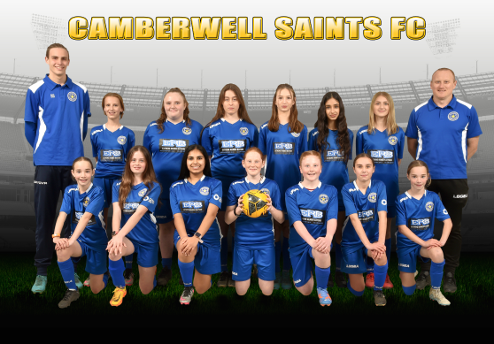
This matters even more with large galleries. You can correct one or two hero shots and still deliver an inconsistent set if other frames drift. The fastest way to lose trust with a team is inconsistency that feels accidental.
So when I work as a Melbourne sports photographer, I think like an editor. I treat the gallery as a product, not a pile of individual images.
That’s the backbone of what Pure Sport Images offers: a disciplined approach where color, sharpness, and storytelling align.
The final thing fans notice: realism
When people say they love a sports gallery, what they’re really reacting to is whether the images feel true. They want the emotion, the texture of the moment, and the sense that someone was there and understood what mattered.
Color is the bridge between “captured” and “remembered.” If you nail it, the images feel immediate. If you miss it, the images feel like a record from a different universe.
Melbourne’s venues, light, and pace make that bridge harder to build, but that’s part of the job. You learn to read conditions quickly, you decide how much mood to keep, and you refine the result without losing authenticity.
That is the art of color in Melbourne sports. Not a filter. Not a trend. A craft, done under pressure, with an eye for both the game and the way it will live in people’s memories.
If you’re hiring a sports photographer Melbourne team, or you’re looking for Melbourne sports photography that feels consistent across matches, that’s where Pure Sport Images earns its reputation. Color is not the garnish. It’s part of the proof.
Pure Sport Images
23 Grandview Ave, Mulgrave VIC 3170, Australia
+61 413 157 614
[email protected]
Website: https://puresportimages.com.au/